Polar Diagram

Available In Only Races, Aggregate all Dates in Event, individual races/trainings, Performance Database, Entire Day
Requires True wind angle and speed (TWA/TWS) data
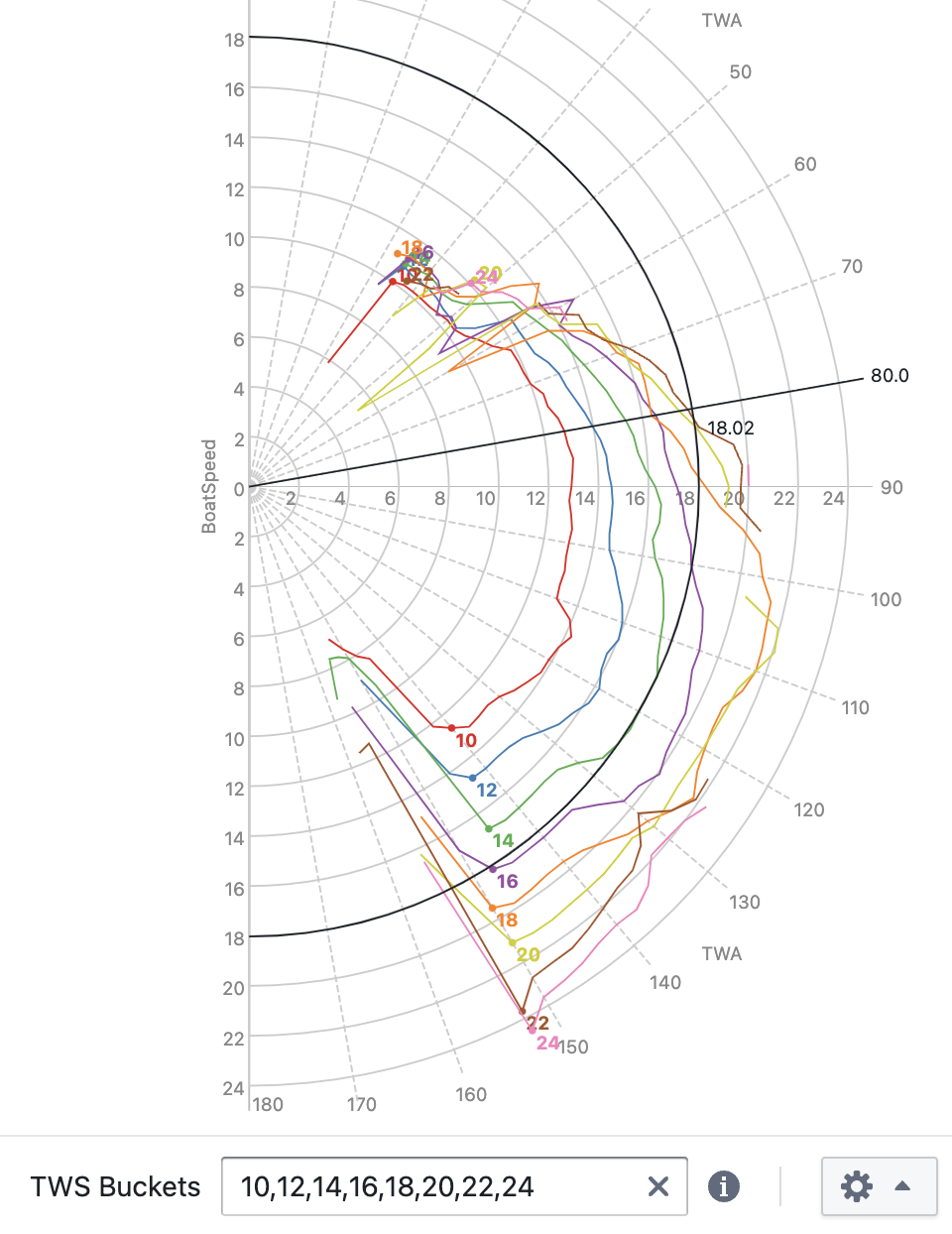
See your actual performance against targets across all wind angles and speeds in the classic radial polar format. Each TWS bucket is drawn as a curve; polar targets overlay directly for comparison. Use this view to identify where your boat is fast and where speed is being left on the table.
Each point in the diagram represents measured BoatSpeed at a given TWA, grouped into TWS buckets.
Two labeled points on each TWS line represent the upwind/downwind angles with best VMG (target boat speed).
Consider limiting the visualization to only a small handful of TWS buckets, especially when comparing different performance database entries, or when comparing port to starboard data (enable Color by Tack in the settings menu), to keep the diagram readable.
Consider increasing the Smoothing setting if you have limited data and lines appear jagged. However, for best results, the more data you can collect the better.
Use the Speed Metric configuration menu to select either BoatSpeed or SOG as the speed metric.
Use the zoom buttons or your mouse wheel to zoom into crowded areas.
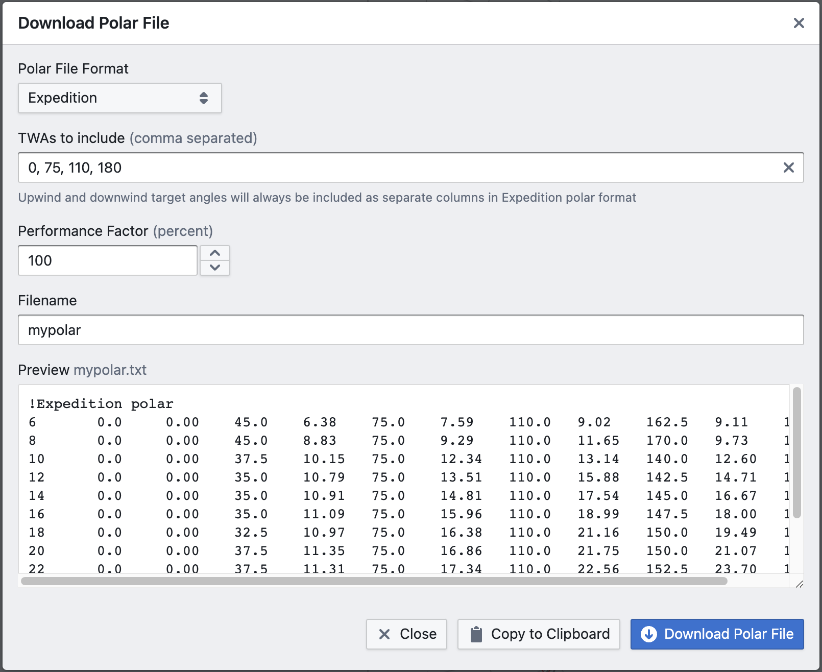
Use the Download button to download the polar data in one of the supported polar file formats:
- Expedition
- B&G
- Deckman
- Adrena
- ORC
- SailGrib
How data is processed
-
TWS and TWA bucketing — data points are grouped by TWS bucket (configurable centre values) and by TWA bucket according to the configured granularity (e.g. 5° increments). Smaller TWA increments produce finer resolution but require a larger, cleaner dataset to populate each bucket reliably.
-
Ordering by performance metric — within each TWS × TWA bucket, data points are ranked by the selected speed metric (BoatSpeed by default).
-
Quantile selection — the representative value for each bucket is the configured quantile (default: 90th percentile). This filters out the lowest-performing moments while retaining a stable, data-driven estimate of achievable speed at that wind condition.
-
TWS lines — all buckets sharing the same TWS value are connected to form a single curve, plotted radially from 0° to 180° TWA.
-
Polar diagram — the curves for all TWS values together form the complete polar diagram.
Configuration: what to change and why
TWA granularity
Smaller TWA bucket increments (e.g. 2° instead of 5°) produce a higher-resolution curve but spread the same data across more buckets, so each bucket contains fewer points. With limited data this makes individual bucket estimates noisy and the curve jagged — the Smoothing setting compensates for this, but finer granularity only helps if the dataset is large and clean enough to support it.
Quantile
The quantile (step 3) controls which level of performance is treated as representative for each TWS × TWA bucket. The default 90th percentile discards the bottom 90% of moments in each bucket, keeping only the fastest. Raising it (e.g. to 95th) produces a more aspirational polar by selecting only the very best moments; lowering it (e.g. to 75th) produces a more conservative one that reflects typical good performance rather than peak performance. Unlike the Targets view, there is no separate selection metric here — the same metric (BoatSpeed or SOG) is used for both ordering and display.
TWS bucket boundaries
The default bucket centres (6, 8, 10, … 30 knots) are evenly spaced. If your sailing data is concentrated in a narrower wind range, custom bucket boundaries let you increase resolution where the data is dense and avoid near-empty buckets at the extremes.